
YouTube Thumbnail Design Tips to Increase CTR and Views
Learn YouTube Thumbnail Design techniques that improve CTR, attract viewers, and make your videos more clickable in a competitive market
Published on Aug 10, 2026
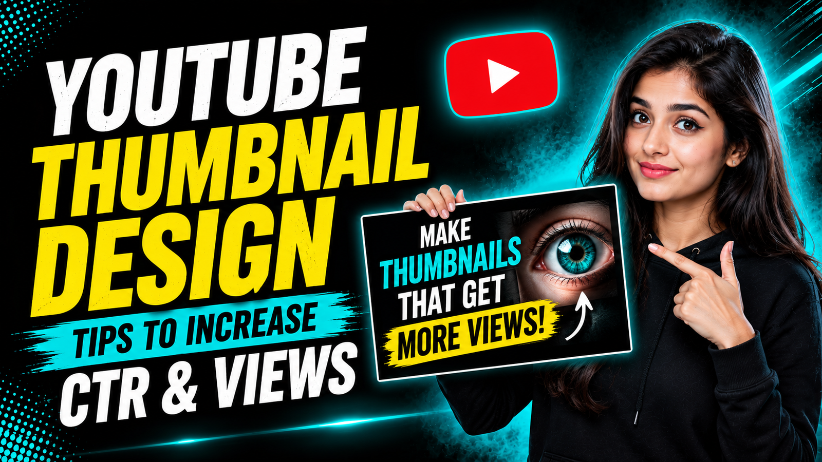
YouTube Thumbnail Design plays a major role in determining whether someone notices your video or scrolls past it. A strong video can remain undiscovered when its thumbnail fails to communicate value quickly. Whether you plan to buy YouTube channel assets or eventually sell your YouTube channel, understanding how to present content effectively is essential, and vilyz.com can be useful when exploring the broader creator marketplace. A thumbnail is not simply an attractive image; it is the visual promise that introduces your video before viewers hear a single word.
Why Thumbnails Matter More Than Most Creators Think
When people browse YouTube, they are exposed to hundreds of videos competing for their attention. The thumbnail is one of the first elements they see, along with the title. This means creators have only a small visual space to communicate what makes their video worth watching.
A thumbnail does not need to explain everything. Its job is to create enough interest for the viewer to stop scrolling and consider the title.
Think about a thumbnail as the cover of a book. A book cover cannot tell the entire story, but it can communicate the genre, mood, subject, and overall quality. A YouTube thumbnail works similarly.
Many creators make the mistake of putting the complete video title on the thumbnail. This often produces too much text and makes the design difficult to understand on a smartphone. Instead, the thumbnail should complement the title.
For example, if your title explains how to grow a channel from zero subscribers, the thumbnail might focus on a dramatic transformation, a large subscriber counter, or a simple phrase such as “0 TO 100K.” The title provides context while the image creates curiosity.
Another important consideration is visual competition. Your thumbnail will appear beside many other thumbnails. If everything looks similar, viewers have little reason to notice yours.
This is why contrast, composition, facial expressions, typography, and color can make such a significant difference.
However, good design does not mean adding more elements. In many cases, simplicity creates a stronger visual message. One person, one main object, and a few words can be more effective than a crowded design containing numerous icons and graphics.
Creators should also remember that thumbnails are displayed at different sizes. A design that looks excellent on a large computer monitor may become unreadable on a mobile screen. Always evaluate the thumbnail at a small size before publishing.
The best thumbnail is therefore not necessarily the most complicated one. It is the one that communicates the video's main idea quickly and clearly.
Use Contrast to Capture Attention
Color is one of the most powerful tools available to creators. Strong contrast can separate the main subject from the background and make important words immediately visible.
A common design approach is to use a dark background with one or two bright accent colors. This creates visual separation without making the entire image overwhelming.
For example, a black background combined with bright cyan can create a modern technology-focused appearance. Yellow can be used for important words, while white can provide clean supporting text.
The exact colors matter less than the contrast between them.
If the background is bright and the text is also bright, the message may disappear. Similarly, placing dark text over a dark background makes the thumbnail difficult to read.
Before finalizing a design, reduce the thumbnail to a small size and ask yourself one question: can I understand the main message immediately?
If the answer is no, simplify it.
Another useful technique is to use visual separation around important subjects. A subtle glow, shadow, outline, or contrasting background can help a person stand out from the surrounding environment.
Faces can also attract attention because viewers naturally recognize human expressions. A surprised, excited, curious, worried, or thoughtful expression can communicate an emotional reaction to the topic.
However, expressions should match the subject. Artificially exaggerated reactions may work in certain entertainment niches, but they can appear less credible in educational, professional, or business content.
The same principle applies to typography. Large, readable text should be used strategically rather than filling every available space.
If your thumbnail contains five lines of small text, viewers may ignore it completely. Two or three large words can often communicate more effectively.
Good YouTube Thumbnail Design is ultimately about visual hierarchy. Viewers should know where to look first, second, and third.
The primary subject should receive the strongest visual attention. The headline should be immediately readable. Secondary elements should support the message rather than compete with it.
Create Curiosity Without Misleading Viewers
A successful thumbnail creates curiosity, but curiosity should not become deception.
Clickbait can produce short-term clicks while damaging viewer satisfaction. If the thumbnail promises something that the video never delivers, viewers may leave quickly and become less likely to trust future uploads.
The strongest approach is to highlight the most interesting genuine aspect of the video.
Suppose you are publishing a video about testing five editing applications. Instead of using a generic screenshot of all five applications, highlight the surprising result of the test. The thumbnail might show the winning application, a dramatic comparison, or a visual transformation.
The viewer should immediately understand that something interesting happened.
Another effective technique is the before-and-after concept. Transformation naturally creates curiosity because people want to see how one state became another.
This works for many niches. Fitness creators can show progress. Designers can show an old and improved version. Businesses can show revenue changes. Video creators can show an editing transformation. Gaming creators can show a difficult challenge before and after completion.
Numbers can also make thumbnails more specific. A clear number gives viewers an immediate understanding of the video's scope.
For example, “7 Mistakes,” “30 Days,” “100 Videos,” or “$10 vs $1,000” can create a clear visual structure. Numbers should only be used when they accurately represent the content.
Another technique is selective information. Instead of revealing the complete result, show enough information to create a question.
For example, a thumbnail could show a blurred result with a large arrow pointing toward it. The title then provides additional context.
This works because the viewer's brain naturally wants to complete incomplete information.
Nevertheless, avoid excessive arrows, circles, emojis, and decorative elements. When every object is highlighted, nothing feels important.
The goal is to create one dominant visual story.
Creators who are researching a YouTube channel for sale should pay attention to the existing thumbnails as well as subscriber numbers. A channel's visual identity can reveal whether the audience has been attracted through consistent content or through unrelated viral uploads.
Likewise, when evaluating a decision to buy monetized YouTube channel opportunities, the quality and relevance of previous content should be examined carefully. A channel with strong historical views may still require a completely different creative direction after a change in ownership.
Build a Recognizable Thumbnail Style
Consistency can help viewers recognize your content before they even read the channel name.
This does not mean every thumbnail should look identical. Instead, establish recurring design elements that create a recognizable identity.
You might consistently use a particular font, background treatment, color combination, subject placement, or visual framing.
For example, a creator could use dark backgrounds, bright cyan accents, large yellow keywords, and a person positioned on the right side. Over time, viewers may begin recognizing the channel's content immediately.
Brand consistency becomes especially valuable when a viewer sees multiple videos from the same creator in their recommendations.
However, consistency should not become repetition. If every thumbnail has the exact same composition, the channel may start looking predictable.
Create a flexible visual system instead.
Choose a small group of brand colors and typography styles. Then adjust the layout depending on the subject of each video.
A tutorial might use a large interface screenshot. A storytelling video might feature a person's expression. A case study might emphasize a number or transformation.
The underlying design language remains consistent while the individual thumbnails remain distinct.
Another important factor is image quality. Blurry screenshots, low-resolution photographs, poor cutouts, and inconsistent lighting can make a professional channel appear amateurish.
Whenever possible, use high-resolution source images and ensure the main subject is clearly separated from the background.
Lighting also influences perceived quality. A subject with strong lighting and clear facial details usually attracts more attention than a dark or poorly exposed image.
Backgrounds should support the subject rather than overpower it. A simple gradient, subtle texture, blurred environment, or controlled visual effect can provide depth without distracting from the main message.
This is particularly useful for creator channels where the person is the central brand.
The best platform to buy YouTube channel options should not be judged only by visible subscriber counts. When evaluating an established channel, examine its content style, audience expectations, historical performance, and whether its visual identity can support your future direction.
Similarly, anyone searching for a trusted Platform to buy YouTube channel should consider whether the channel's existing audience aligns with the content they intend to publish.
Test, Analyze, and Improve Your Thumbnails
Even experienced designers cannot predict exactly how every thumbnail will perform. Data provides valuable information about what viewers actually respond to.
One of the most important metrics is click-through rate. It helps indicate how frequently viewers choose a video after seeing its impression.
A low click-through rate can suggest that the title, thumbnail, or combination of both is not creating enough interest. However, the metric should be interpreted in context.
A high click-through rate does not automatically mean the video is successful. If viewers click but leave quickly, the packaging may be promising something the content does not deliver.
This is why thumbnail performance should be considered alongside retention, watch time, traffic sources, and overall viewer satisfaction.
When a video performs well, study its packaging. What visual element may have attracted viewers? Was the subject especially recognizable? Was the title complementary? Did the color contrast make the thumbnail stand out?
Then apply those lessons to future designs.
Do not simply copy a successful thumbnail. Identify the principle behind its success.
For example, if a thumbnail performed well because it clearly showed a before-and-after transformation, use that structure for another relevant topic rather than reproducing the exact design.
Creators should also analyze competing thumbnails. Search for videos covering similar subjects and observe the visual patterns that dominate the results.
If every competitor uses a person's face on the left and text on the right, consider whether a different composition could make your video visually distinctive.
At the same time, avoid being different simply for the sake of being different. The design still needs to communicate the subject quickly.
Testing different approaches over time can help establish what works best for your audience.
You can review channel performance and available analytics through https://studio.youtube.com/. Use the information to compare videos, identify patterns, and make better decisions about future packaging.
A thumbnail should never be treated as an afterthought. It is part of the content strategy from the moment a video idea is developed.
When the topic, title, thumbnail, and opening of the video all make the same promise, viewers receive a consistent experience from impression to watch.
Strong YouTube Thumbnail Design does not require expensive software or complicated effects. It requires clear communication, strong visual hierarchy, thoughtful contrast, and an understanding of what makes your audience curious.
The most effective designs usually have one central message. They make the subject obvious, create a reason to click, and leave enough information for the viewer to become curious about the video itself.
Whether your future plans involve choosing to buy YouTube channel opportunities or deciding to sell your YouTube channel, visual presentation remains an important part of building a strong creator brand. Exploring options through vilyz.com can support the marketplace side of that journey, while strong thumbnails, valuable videos, and consistent audience-focused content remain the foundation of sustainable YouTube growth.